
I am working on a production issue. I do not think that we have a database issue but I am graphing some performance metrics to make sure. I made a new graph in my PythonDBAGraphs program.
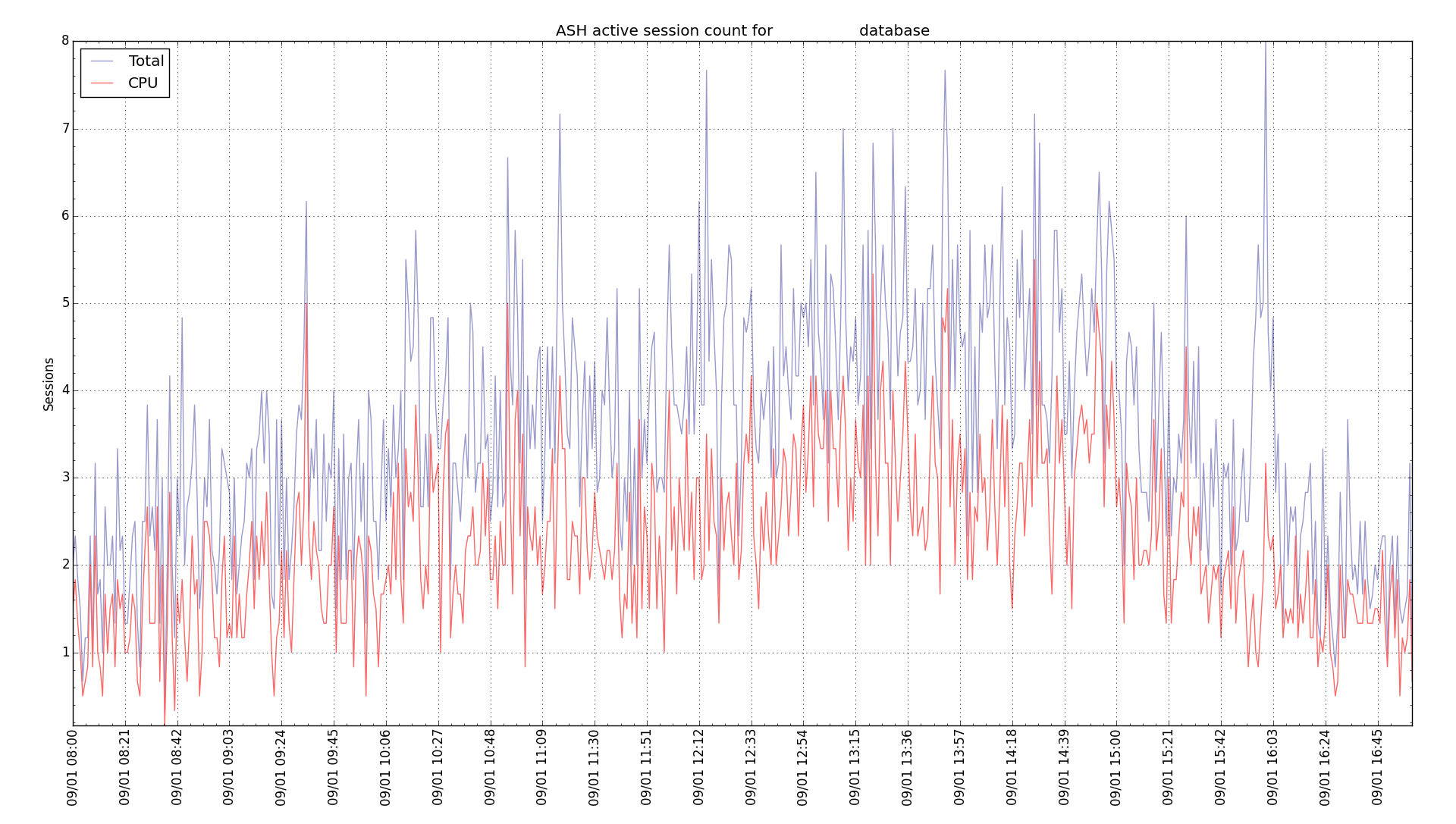
It shows the average number of active sessions for a given minute. It prompts you for start and stop date and time. It works best with a relatively small interval or the graph gets too busy. Red is sessions active on CPU and blue is all active sessions. This graph is a production database today. Activity peaked around mid day.
It is kind of like the OEM performance screen but at least having it in Python lets me tinker with the graph to meet my needs. Check out the README.md on the GitHub link above if you want to run this in your environment.
Bobby

Thanks sir for sharing the knowledge. I am regular reader of the blog…within short time i have read so many things from your blog…Thank you very much….
Thanks for your comment. I am glad that the blog posts have been helpful to you.
Bobby