
Still tweaking my Python based Oracle database performance tuning graphs.
I kind of like this new version of my “sigscpuio” graph:
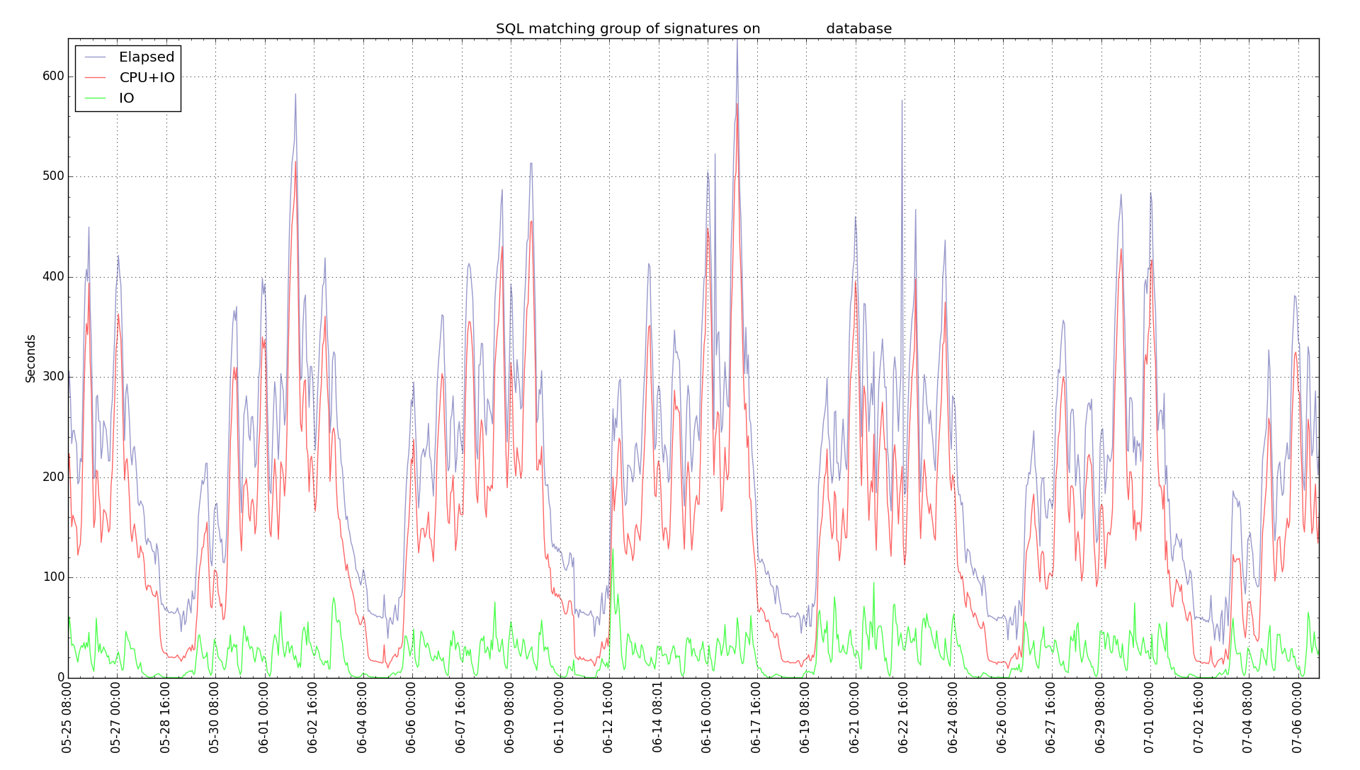
The earlier version plotted IO, CPU, and Elapsed time summed over a group of force matching signatures. It showed the components of the time spent by the SQL statements represented by those signatures. But the IO and CPU lines overlapped and you really could not tell how the elapsed time related to IO and CPU. I thought of changing to a stacked graph where the graph layered all three on top of each other but that would not work. Elapsed time is a separate measure of the total wall clock time and could be more or less than the total IO and CPU time. So, I got the idea of tweaking the chart to show IO time on the bottom, CPU+IO time in the middle, and let the line for elapsed time go wherever it falls. It could be above the CPU+IO line if there was time spent that was neither CPU or IO. It could fall below the line if CPU+IO added up to more than the elapsed time.
So, this version of sigscpuio kind of stacks CPU and IO and just plots elapsed time wherever it falls. Might come in handy.
Bobby
