
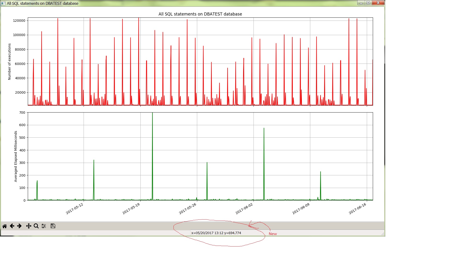
I modified PythonDBAGraphs to use datetime objects on the X axis for all the reports except ashcpu.py. This lets you hover the mouse over a point and see the date and time for the point. Previously I was using text strings as labels with dates and times on the X axis and it was not obvious which point was for which date and time.
Here is a screenshot:
 I have an example of a graph using datetime objects in an earlier post: post
I used two very helpful pages from the Matplotlib documentation: doc, example
I uninstalled cx_Oracle 6 and went back to version 5.3. This resolved the bug I mentioned in my earlier PythonDBAGraphs post. This enabled me to take out the TO_CHAR function calls that I had just added to work around the bug. The SQL queries looks simpler and easier to understand now.
I modified the README.md to include my new list of installed packages.
I feel like these changes will make the existing graphs more useful to me. Also, the code and SQL queries are cleaner now so it will be easier for me to create new graphs in the future.
Bobby
